New blog design
Provoked by my blog move, I decided to give it a new design as well. The old design always felt a little bleh.
As I’ve probably mentioned, I suck at design. I know when I like something, but I’m terrible at coming up with something cool from scratch. So I try to keep it simple and look for other simple designs to bite off. Otherwise I’m liable to burn way too much time spinning my wheels.
In this case, I found Nicolas’s The Jolly Teapot. I loved the clean and simple vibe. I didn’t want to copy him completely, so I kept my content centered, kept a footer, used different colors, etc. I did steal his font choice, though (Charter). And added a little piece of unicode flair to my title, which changes in light and dark mode.
Nicolas, if you ever read this, I hope you’re a believer in that line about imitation and flattery. In this case, it’s accurate![1]
Dear reader, if you see anything wonky, please email me.
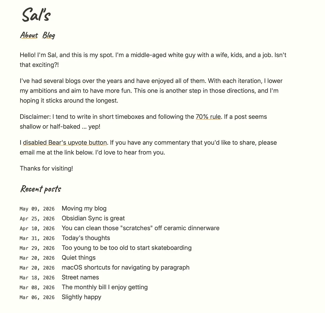
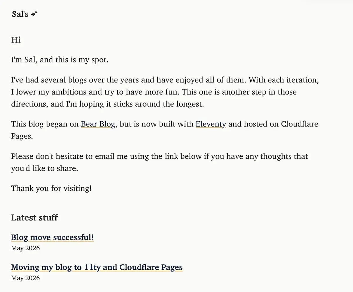
And for posterity, here are pics of the old and new.
Old design
New design
I ended up emailing Nicolas about it, and he was superbly gracious. ↩︎
- ← Previous
Moving my blog to 11ty and Cloudflare Pages - Next →
Blog move successful!